Monetizing video collaboration at Vimeo
Web Design • UX Design
Overview
In 2022, Vimeo pivoted their go-to-market monetization strategy by shifting away from storage caps to per seat pricing. The goal was to maximize the value of video features available per user. As part of this shift, we, as designers were tasked with redesigning the way our users purchased video features and offerings.
I was part of the Teams & Collaboration product area responsible for administrative controls, such as user permissions, and video collaboration tools for the core Vimeo platform. As part of this initiative, I led design for the pricing upsells and the checkout flow within the share video feature.
This project was done in cross-collaboration with multiple teams; growth, transactions, legal, UX writing, sales, and marketing.
MY ROLE
Product Design Lead
DURATION
Jan - Apr 2022
IMPACT
$7M in revenue, 15% increase in business domain sign-ups
THE PROBLEM
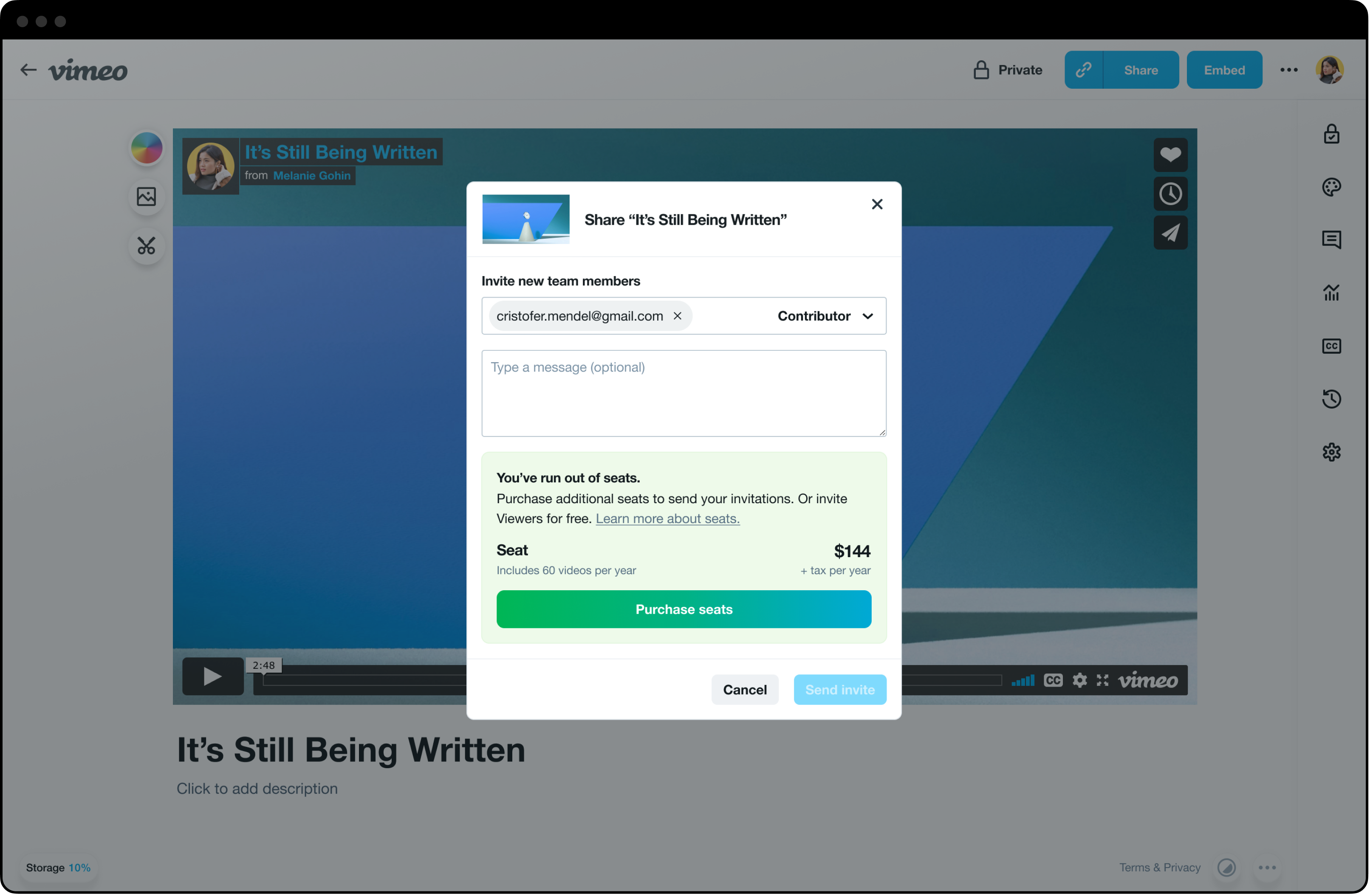
When an owner invites a new team member to edit a video, they have to purchase an additional seat. In the current experience, they are redirected to another window which disrupts their current workflow. This causes friction and reduces the chances of purchasing additional seats.
THE DESIGN CHALLENGE
THE AUDIENCE
How might we design a low friction checkout experience that allows owners to purchase additional seats without disrupting their current workflow?
Owners of Vimeo accounts responsible for inviting new team members, managing roles and permissions for video collaboration.
The design process
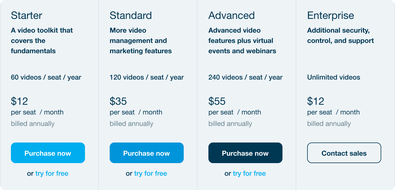
To kick off the design challenge, I held an ideation session with our product manager to understand the use cases to solve for within a complex system of roles and permissions. My priority was to understand the cost breakdown per seat within each pricing tier plan and how best to represent price transparency to maximize value for our users.
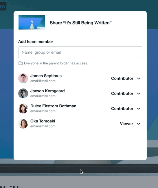
How purchasing seats work
When sharing a video, owners of Vimeo accounts are able to invite more team members to collaborate. If there are no remaining seats available to assign to a new member, purchasing an additional seat is required.
Cost breakdown per role
Viewer roles = free
Contributor roles = cost per seat per tier plan
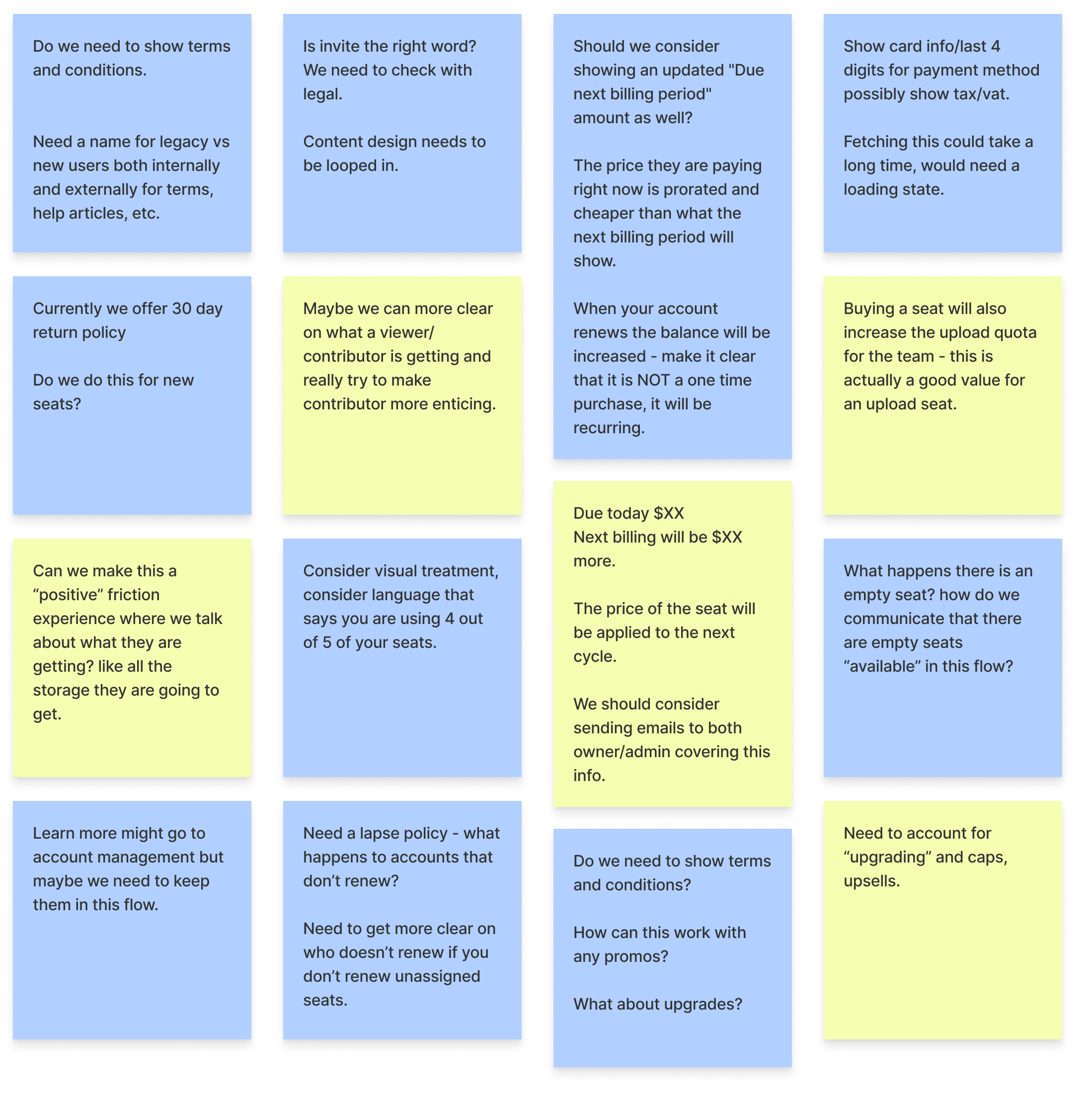
Questions capture multiple use cases
As a first step, I created a list of questions to account for all use cases. Since we were designing solutions for monetization there were multiple use cases to consider across key stakeholders. Questions also allowed us to learn more about the complexities around administration within the platform.
Legal and billing
Consulting our legal and billing team gave us an understanding of how the complex system worked. “Do we need a lapse policy? “What happens to accounts that don’t renew?”
UX writing and marketing
Leading with questions also allowed us to identify collaboration partners such as our UX writing and marketing team. This allowed us to ensure correct usage of copy and price terminology.
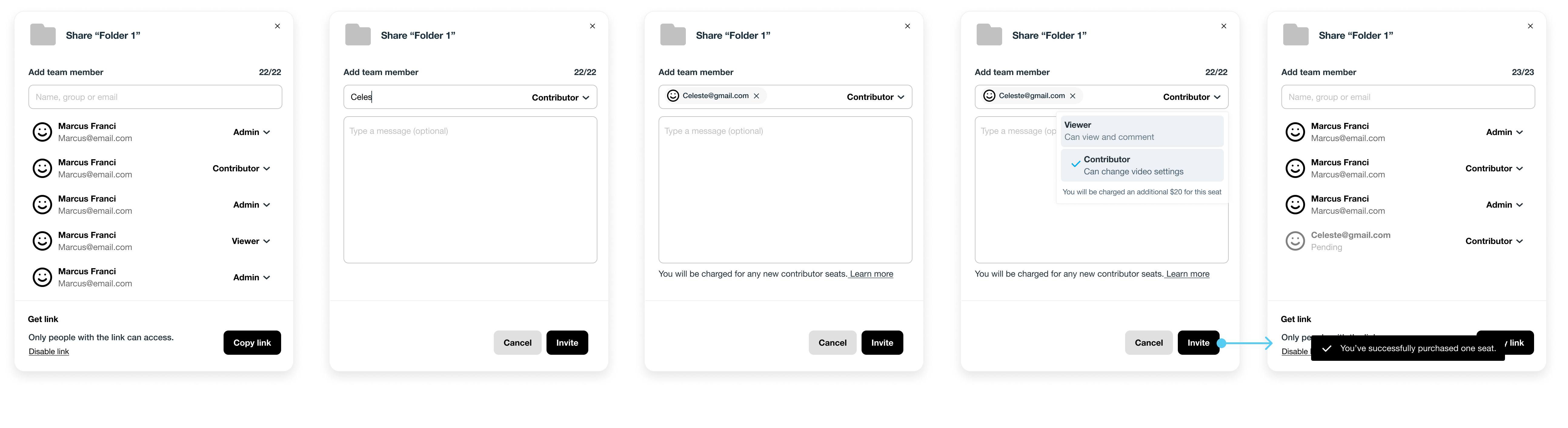
Identifying use cases through wireframes
As we got more clarification on the use cases, I created three solution hypotheses with varying levels of engineering effort for the low friction checkout experience.
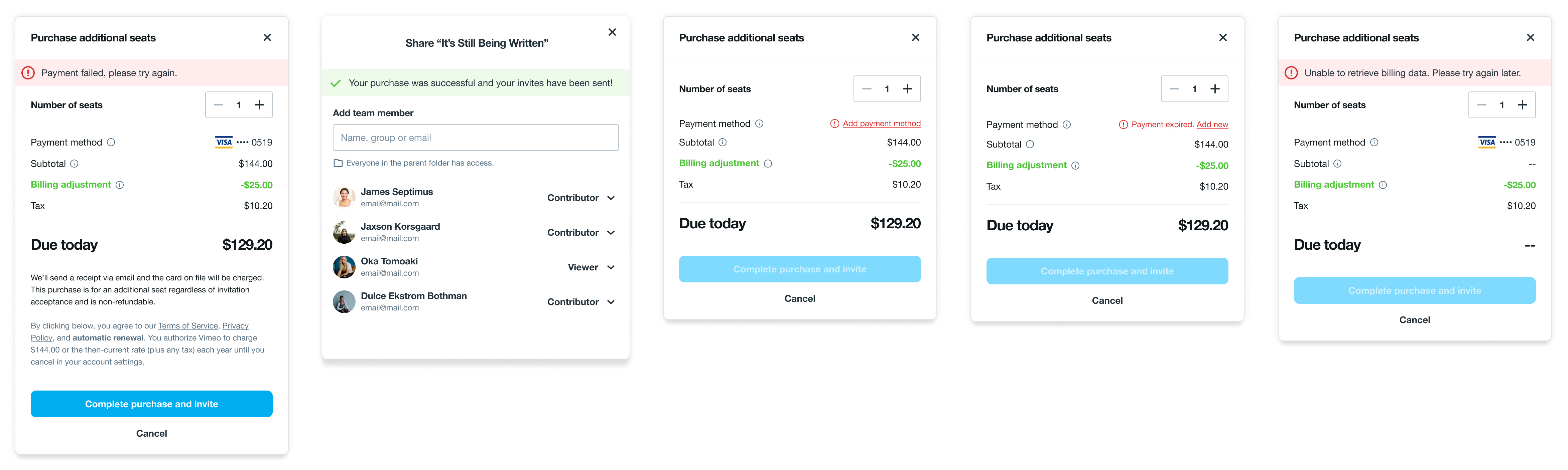
The key components of the solution are the share modal, the pricing upsell, prompting users to purchase an additional seat, and the transactions modal to complete the purchase. My priority was to create an experience with the minimal amount of steps from initiation to completion — all within the same modal experience.
Option 1: Lowest LOE. Automatic seat purchase when invite CTA is clicked.
Option 2: Medium LOE. Itemized cost information and purchase on modal.
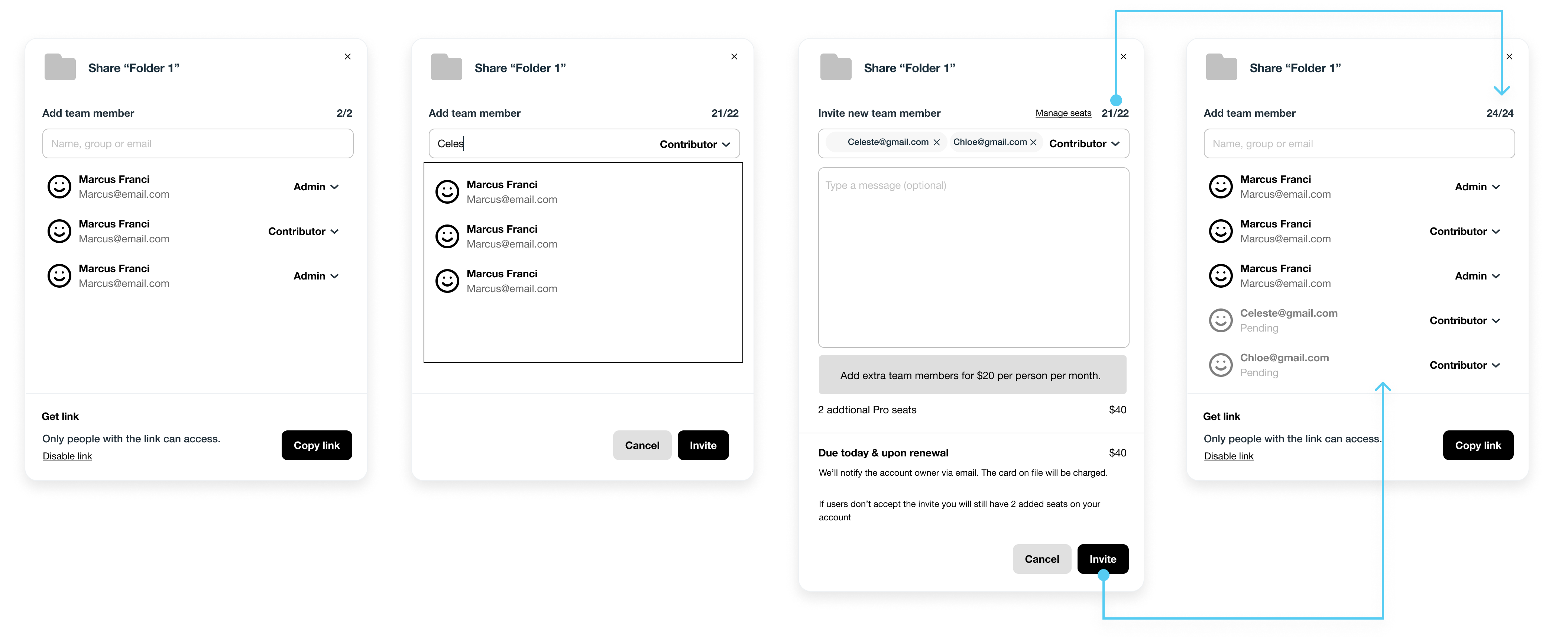
Option 3: Medium LOE. Information architecture: upsell → itemized cost and checkout → confirmation of purchase.
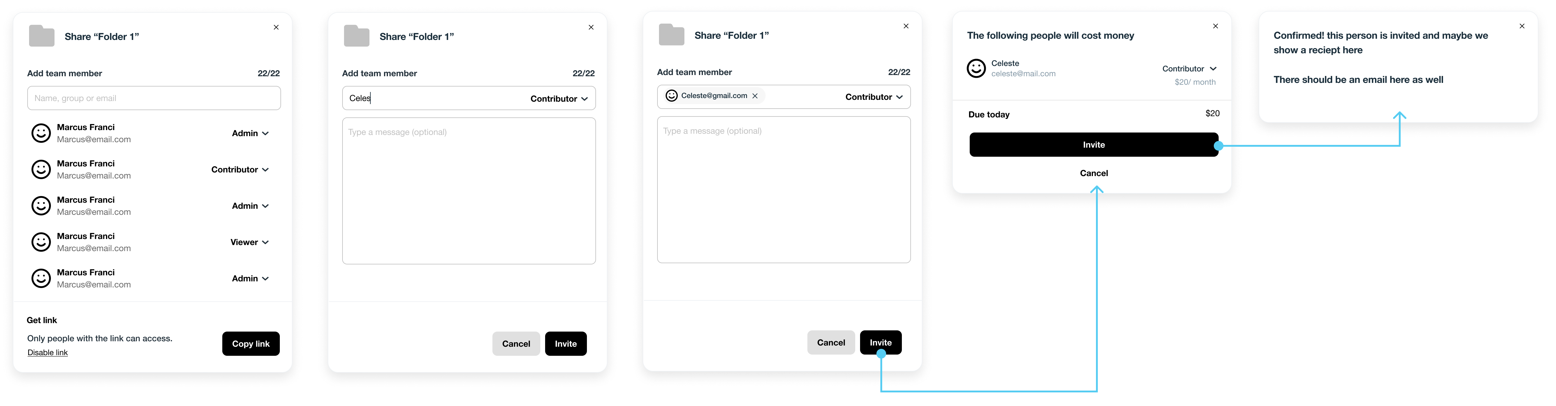
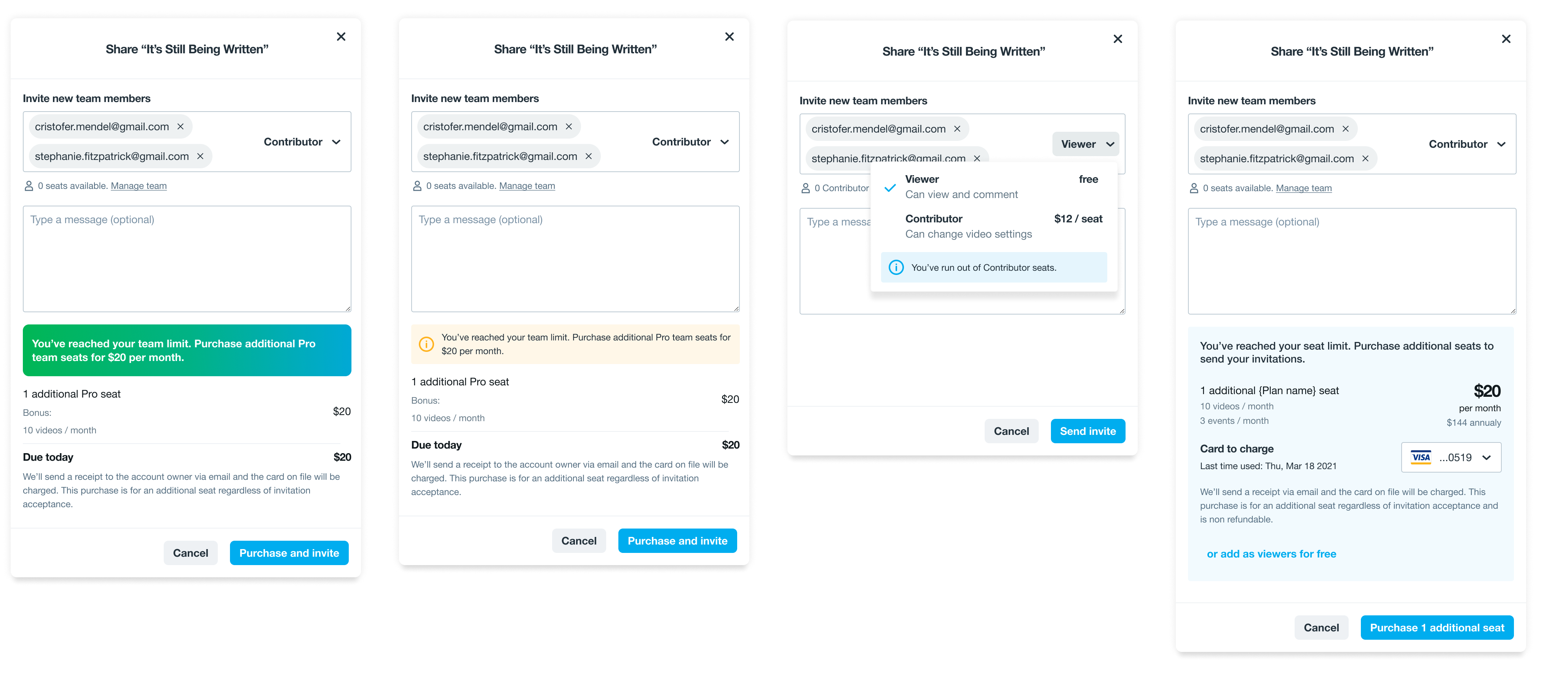
Through feedback from stakeholders, it was clear that content played a vital role in communicating the value of initiating a purchase. In collaboration with Content Design, I created a few approaches to ensure the difference between viewer and contributor roles was effectively communicated. Further, I partnered with Design Systems to ensure consistency across our components when communicating upsells and purchases.
Adapting the UX around copy.
Identifying lowest friction interactions.
Testing initial ideas out to gauge sentiment of low friction solution
Once we finalized our UX approach, the next step was to create a prototype and conduct a usability test via UserTesting.com. I drafted out a user research study, with two goals:
- Test our hypothesis that a low friction checkout experience is the right solution to purchasing additional seats when sharing a video.
- Identify any gaps and opportunities in our UX approach.
We interviewed 7 existing Vimeo users and 6 prospects across America, UK, New Zealand, and Australia.
research insights
1.
When purchasing, users are risk averse and price sensitive. Transparency of cost breakdown is important.
2.
There was a lack of understanding the value of purchasing additional seats. Opportunity to improve language.
3.
Positive response towards usability of the checkout flow. Rated 4.7 out of 5 on usability.
Iteration and designing for error
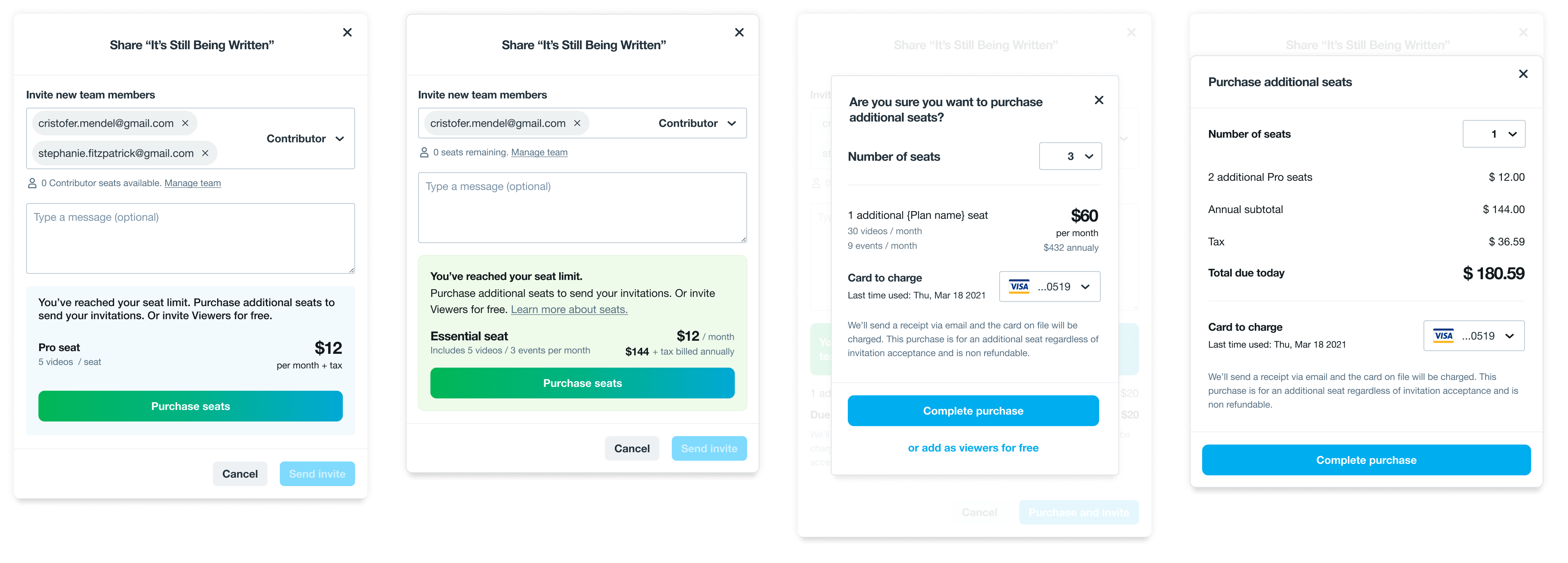
Based on our findings, we had an opportunity to improve our content to further provide transparency on our value offering. We included essential information within our renewal policy and terms copy. I partnered with our engineering team in India to account for multiple edge cases such as designing banners and error messages. For example; where do we redirect users when their payment has expired? How do we provide as much context around error to minimize frustration?
The final polish
Value of additional seats
As an owner invites a new team member to collaborate, they have the ability to toggle permissions from a viewer → contributor with a component that displays the value of each role. With a contributor role, they are prompted to purchase an additional seat with a direct CTA.
Frictionless checkout
As a user clicks on ‘purchase seats’, the modal displays a cost breakdown without redirecting the user to another page. The user is able to read through the terms and has a direct CTA to both actions: purchasing an additional seat and inviting a team member. To minimize error, a user has a few seconds to cancel the purchase if required.
Back to current workflow
The user is immediately directed back to their current workflow. Once the purchase is successful, a confirmation banner is displayed on the initial share modal. And the user is free to proceed with their job to be done.
Quality assurance
The final step was conducting quality assurance sessions to ensure all designs were aligned with the product live in production.
METRICS OF SUCCESS
On May 1st, 2022, the new pricing & packaging strategy launched live to 100% of prospective customers in Australia, New Zealand, and the United Kingdom.
This project impacted 65% of revenue growth and forecasted $7m in revenue across all routes to market. The low-friction checkout experience resulted in a 15% increase in business domain sign-ups.
Lessons learned
Questions drive better solutions
A successful UX solution places content at the center
Design for error: design solutions for when things go wrong
Always advocate for low friction as it helps users get their job done faster
 in Sri Lanka