Buoy Health • Product Design Lead • 2021
Finding product-market fit for a healthcare marketplace
UX / UI Design • User Research • Design Systems
Launching an MVP during a global pandemic in a highly regulated and competitive healthcare industry, by uncovering the unmet need in how people seek and access affordable care.

Overview
During the global pandemic, overwhelmed healthcare systems left patients struggling to find the right care. Buoy, an AI-driven health platform, saw an opportunity to bridge this gap by guiding users to the best medical resources within their insurance networks.
As a Series C startup navigating rapid shifts, Buoy pivoted its product offering, and I was entrusted to lead the design of this new product line.
Our approach:
In just 90 days, we launched an MVP by:
Unlocking market opportunities through the Outcome-Driven Innovation (ODI) framework.
Defining product positioning and testing for product-market fit.
Building an accessible design system to streamline development and scale efficiently.
Aligning design decisions with healthcare regulations and industry constraints.
My role
I led user research, product strategy, and design system development, collaborating closely with leadership, engineers, and medical experts to create a solution that balanced user needs, business goals and constraints.
Results & impact
$6.3M
in annual revenue for YE 2021.
2
Major partnerships with insurance providers, Humana and United Healthcare.
4
New B2B customers acquired; The New York Times, Puma, Danaher, and Houston Methodist.

Unlocking the market opportunity
With healthcare access more confusing than ever, we set out to understand the biggest pain points users faced when seeking care. Using the Outcome-Driven Innovation (ODI) framework, our cross-functional team conducted a broad discovery phase before narrowing in on a high-impact, unmet need.
Market research approach:
2,400-person survey (quantitative insights into care-seeking behaviour).
30 in-depth user interviews (qualitative insights into emotional and logistical barriers).
Key insights on unmet needs:
64% of respondents were unsure when to seek medical advice.
74% struggled to find quality providers due to the lack of insurance and cost transparency.
Core problem to solve: respondents lacked clarity on when and where to seek medical care, often delaying or avoiding treatment due to uncertainty about cost and provider quality.

Repositioning our solution
With a clearly defined problem, Buoy pivoted from symptom triage to healthcare guidance—leveraging AI to guide users toward the best care options based on their health concerns.
Primary audience:
Adults 45+ experiencing ongoing health concerns.
Areas of product focus:
Provider quality
Insurance & cost transparency
Pandemic-related concerns
Go to market strategy:
B2B2C go-to-market strategy
Positioned as a healthcare benefit for employers
Measuring business adoption and high employee utilisation.
Defining the product strategy
Once we had a clear direction, I worked closely with stakeholders—CPO, product management, and business development—to align our design strategy with business goals, technical constraints, and regulatory requirements.
How might we: maximise product value considering a B2B2C strategy to drive business impact?
Stakeholder requirements and constraints:
Employers: needed high utilisation rates to justify partnering with Buoy to offer the solution to employees.
End-users: needed a seamless way to find cost-effective, high-quality care.
Engineers: needed a feasible roadmap within our 90-day launch window.

Hypothesis and concept testing
Before defining core features, I designed a few concepts to test the appetite of our solution approach. We tested the following hypotheses with real users:
Users want personalised recommendations.
Users need a clear list of employer-provided care options.
Users prioritise insurance coverage and cost information.
Insights: Findings confirmed a need for a digital tool to guide people within their next step in medical care, with a focus on insurance coverage and cost transparency.


Scoping the MVP
With a validated concept, our challenge was to balance business value, delivery, and feasibility.
Key MVP components:
Seamless care navigation – A clear landing page showcasing available healthcare tools.
Personalised healthcare recommendations – AI-powered, curated lists of providers based on insurance and medical needs.
Employer-specific resources – A customised experience that surfaced employer-sponsored healthcare benefits.
Engineering feasibility & constraints:
Small team: 2 front-end, 3 back-end engineers → Had to prioritise essential features.
Tight launch timeline: 90 days → Needed a scalable design system for fast iteration.
Regulatory compliance: Had to meet HIPAA and accessibility (WCAG) standards.
Building a scalable and accessible design system
To streamline development, I led the initiative to build Buoy’s first design system, following the Atomic Design Methodology, which allowed us to break down the interface into a scalable and reusable system of components;
Using atoms, molecules, organisms as our foundation, we developed:
Design tokens – standardised colors, typography, spacing, and interactive states to maintain brand alignment.
Scalable UI components – modular elements such as buttons, filters, form fields, and navigation patterns ensuring design consistency.
Accessibility & WCAG compliance –
High-contrast UI for readability and visual clarity.
Clear focus states for keyboard and screen-reader navigation.
Intuitive error messaging and validation for seamless user interactions.
Impact: Our design system reduced engineering bottlenecks, making it easier to iterate and launch updates post-MVP.


Testing, failing, and iterating
Once our high-fidelity prototype was ready, I conducted usability testing with 20 participants to validate the experience.
Key challenge: Initial prototype failed. Users found the experience overwhelming due to excessive information.
User feedback:
“There’s too much happening on the screen at once.”
“I don’t know where to focus my attention.”
“I love the use of illustrations—it makes the experience more inviting.”


Rapid iteration and redesign
With our tight timeline, I ran a 24-hour design sprint to refine the information hierarchy and interaction model.
Simplified layout – clear hierarchy, reducing cognitive load.
Illustrations as wayfinding elements – improved engagement.
Progressive disclosure – surfaced information only when needed.
Result: A dramatically improved user experience that resonated with both end-users and business stakeholders.
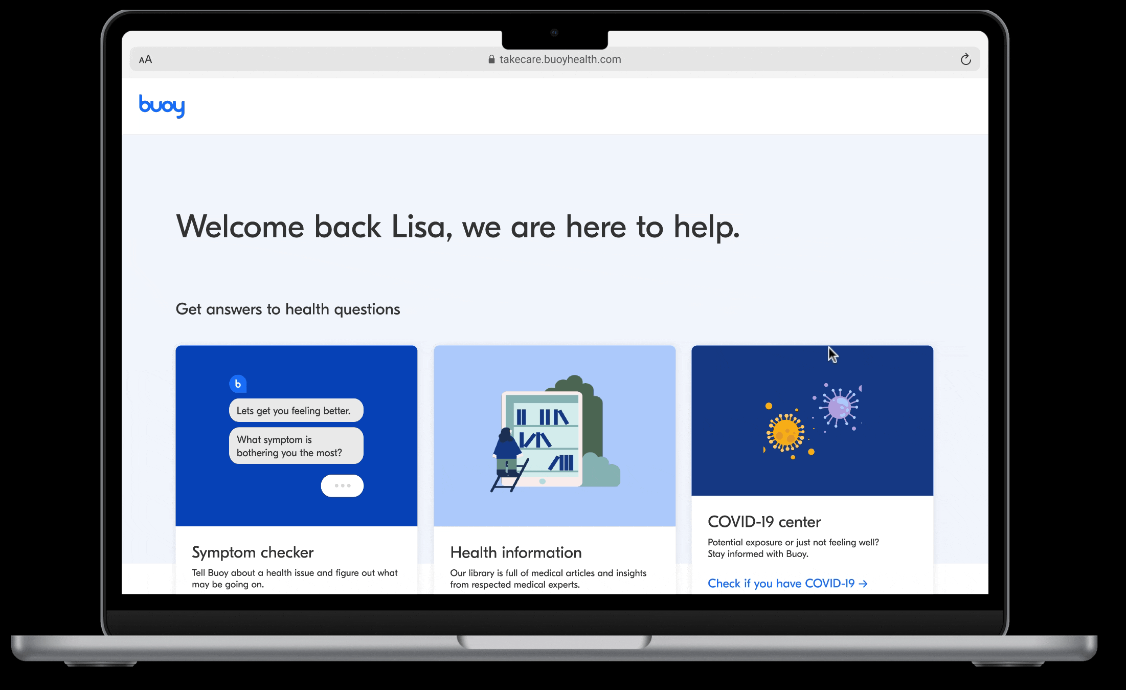
The MVP
Through multiple rounds of A/B/C testing, we refined the experience to be intuitive, straightforward, and accessible. The final information architecture was distilled into two core offerings:
The primary offering
A landing page showcasing Buoy’s suite of health tools, designed with a welcoming and reassuring tone in collaboration with our content team.
The secondary offering
A categorised list of curated health resources, enhanced by our brand team’s playful yet informative illustrations to improve scannability and engagement.
Preparing designs for a successful launch
Ensuring quality & compliance
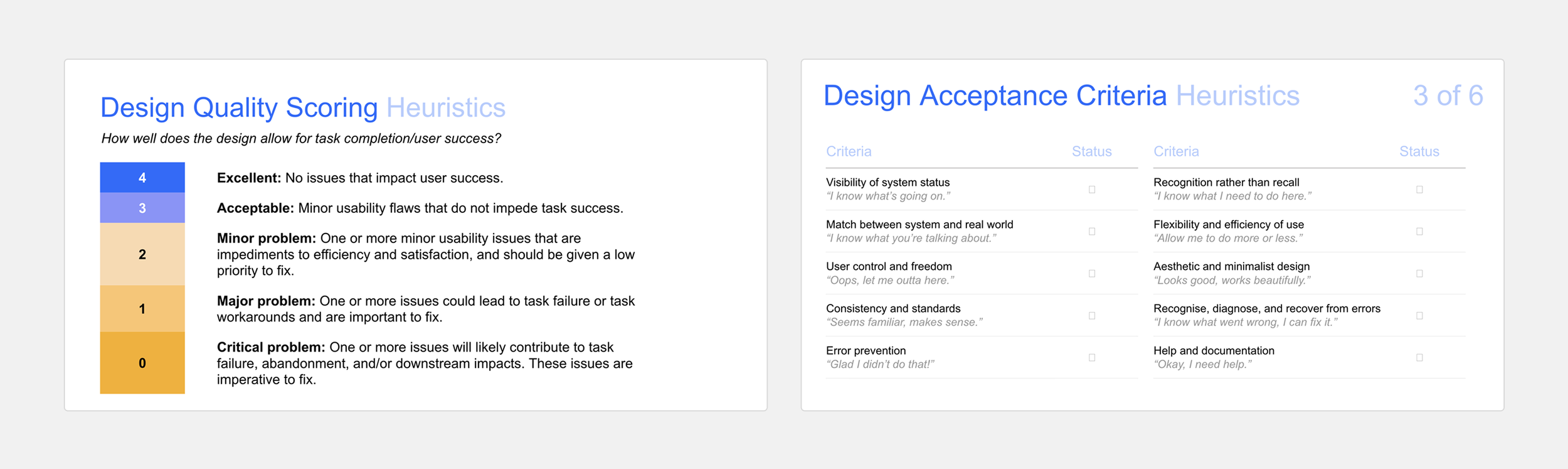
Before development, I conducted a design quality score audit, ensuring:
Accessibility – WCAG compliance for contrast and keyboard navigation.
Usability – alignment to UX heuristics to optimise the user experience.
Regulatory alignment – compliance with U.S. healthcare standards, including HIPAA guidelines.
A smooth transition from design to engineering included:
A final round of usability testing to validate the design approach.
Leading a company-wide readout to align stakeholders, addressing C-suite concerns with user data and insights.
Documented all design specifications and interaction patterns.
Measuring success & adoption
To track the impact of our launch, I defined a measurement framework focused on:
Utilization Rate – Percentage of users actively engaging with the platform.
Click-Through Rate (CTR) – Effectiveness of navigation paths and resource discovery.
Adoption Rate – New user activation and return engagement.
Task Success Rate – Percentage of users successfully finding care options.
Net Promoter Score (NPS) – User satisfaction and likelihood to recommend the platform.
A seamless design-engineering hand-off

Reflections
Challenges
Navigating complexities between ambitious business goals and an evolving market opportunity.
Balancing engineering constraints while strategically prioritising features for impact.
Designing for accessibility and data privacy within a highly regulated healthcare industry.
Lessons learned
Validate early—frequent testing prevents costly assumptions.
Build with accessibility and scalability in mind from day one.
Iterate with agility—setbacks are opportunities for refinement.