Building an MVP for healthcare navigation
Web - Mobile UX Design, User Research, Design Systems
Overview
As the world entered a global pandemic, healthcare systems faced immense pressure to perform. Buoy provided a platform to ease the pressure off of doctors and practitioners — a tool to help triage symptoms through AI and recommend medical resources.
At the time, Buoy was an 80~ person startup with the goal of reaching product-market-fit within a complex healthcare industry. I had the privilege of wearing multiple hats leading user research, systems design, design strategy and execution for our MVP.
This project showcases my process for early-stage product development including discovery market research, hypothesis ideation and testing, and MVP launch within a tight timeline of 90 days. I partnered with the CEO, CPO, CMO, product management and marketing teams, sales development and engineering teams, and our medical associates.
This is one of my best projects and was the most rewarding.
MY ROLE
Product Design Lead
TIMELINE
Jan - Apr 2021
IMPACT
$6.3M in annual revenue, acquisition of three major customers
Identifying product-market fit
To kick off the design challenge, I held an ideation session with our product manager to understand the use cases to solve for within a complex system of roles and permissions. My priority was to understand the cost breakdown per seat within each pricing tier plan and how best to represent price transparency to maximize value for our users.
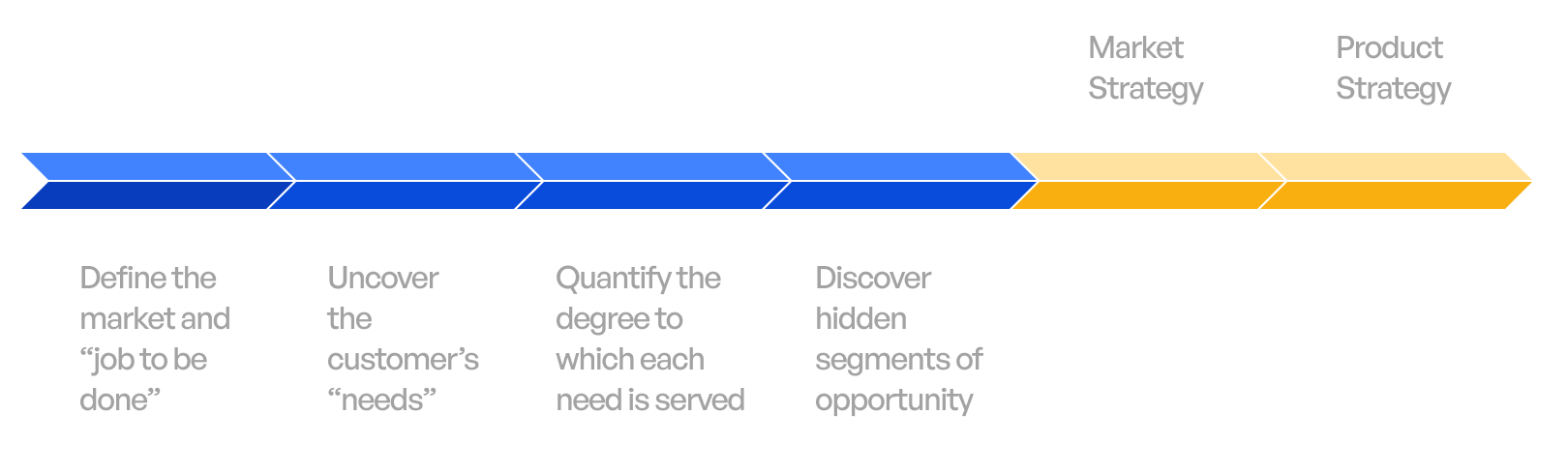
Outcome Driven Innovation Research (ODI)
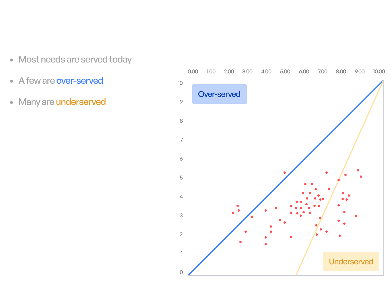
Our Director of UX Research was conducting a market research study using the ODI framework. The framework is used to understand a user’s job to be done and identify hidden market segments of opportunity. The goal was to define a target audience and achieve product-market-fit.
Wearing the UX researcher hat, I partnered with our Director of UX Research to listen in on live interviews, consolidate findings, and identify areas of opportunity. The discovery research included:
- 1x1 in-depth interviews (n=30)
- General population survey (n=~2400)
Research insights = problem statement
64%
of participants mentioned they did not know at what stage of their health concerns they should look for care.
72%
of participants did not know how to go about finding the highest quality provider and often refrained from seeking care because of the lack of transparency around insurance and cost information.
OPPORTUNITY
We found an unmet need around healthcare navigation and the ease of finding recommended resources for each individuals unique health condition. As a result, Buoy pivoted their product offering away from triaging symptoms to healthcare navigation.
THE SOLUTION
THE AUDIENCE
Maximize the ability of helping people make a cost saving healthcare decision on Buoy’s platform.
Age demographic: 45yr+ individuals experiencing regular health concerns.
segments of opportunity
1.
Maximize the likelihood of choosing the highest quality provider.
2.
Maximize transparency of insurance capture and cost information.
3.
Minimize concerns around the pandemic: COVID-19 diagnosis, vaccine information, and mental health.
The design process
As a first step to kicking off this project, I partnered with multiple stakeholders to get a clear understanding of requirements and risks involved within cross-functional teams.
stakeholders & constraints
The business viability risk
Understanding assosicated business risks with CEO & CPO
How can we maximize the business value of the healthcare navigation product?
Our product strategy pivoted to a B2B2C strategy. Taking in our existing infrastructure, the goal was to create a marketplace showcasing Buoy’s health recommendations and resources.
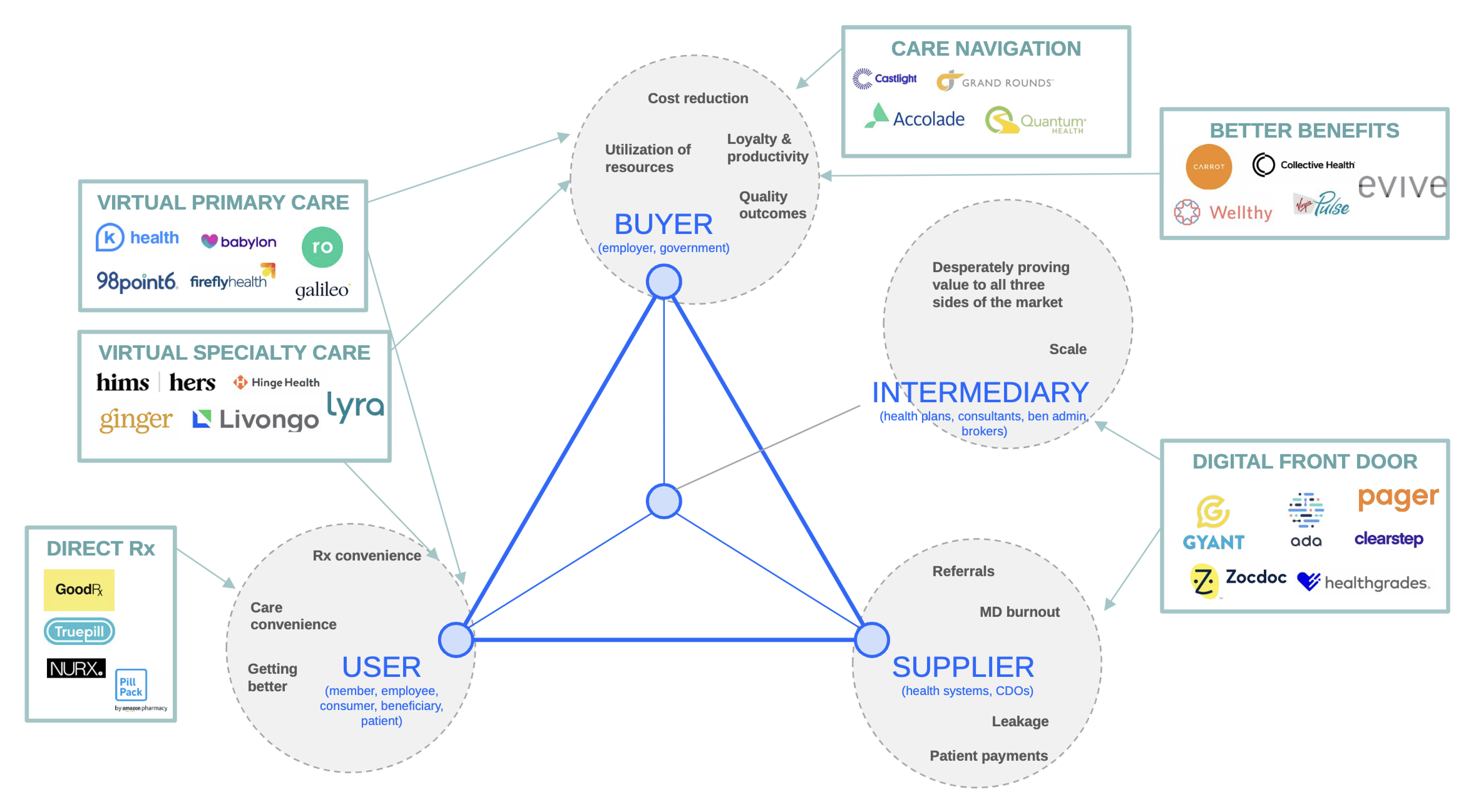
Competitor landscape with our CMO
- What does our competitor landscape look like within a complex healthcare system?
- What differentiates Buoy from key players within the industry?
Sales strategy with Business Development teams
- New sales strategy from insurers → employers
- Employers provide 49% of health insurace in US
- Sales cycle began in 90 days
- 90 days to plan, design, build, launch MVP
STAKEHOLDERS & CONSTRAINTS
The end-user value risk
Next was understanding how best we can deliver value to our end users. In partnership with our product manager, we drafted out solution hypotheses that I translated into concepts and ran a few user tests via UserTesting.com to test our solution approach.
How might we maximize the ability of helping people make a cost saving healthcare decision on Buoy?
Hypothesis #1: Users want to choose a type of care service, this is an opportunity to plug in Buoy’s existing products.
Hypothesis #2: Users want to see a list of care options that are provided by their employer.
Hypothesis #3: Users want to know whether care options are covered by insurance and be aware of applicable copays.
stakeholders & constraints
Engineering feasibility risk
Once we validated our hypothesis, the final step was consulting our engineering team to identify the feasibility of the product features. With a team of 2 front-end engineers and 3 back-end engineers we narrowed down our scope for the MVP.
Concept ideation
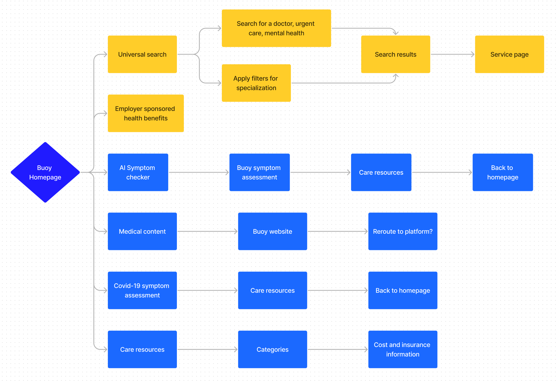
User journey mapping
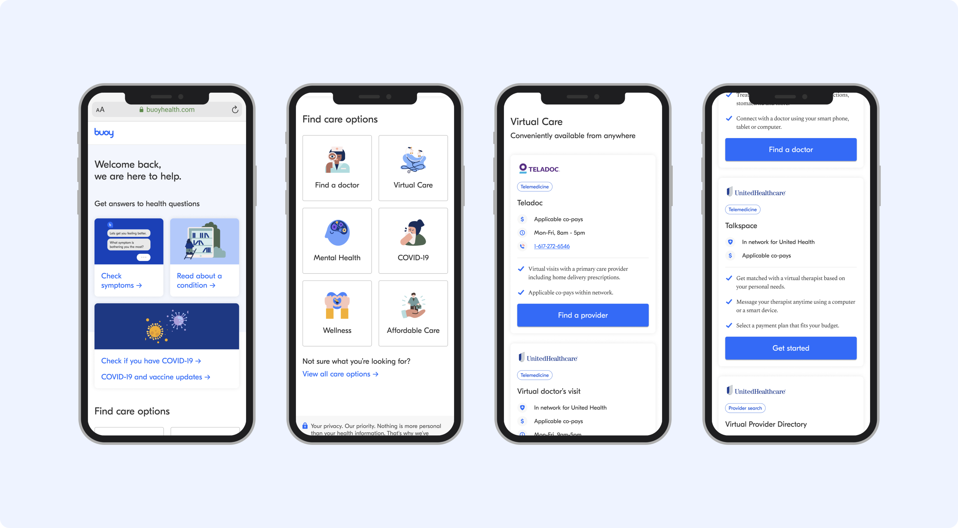
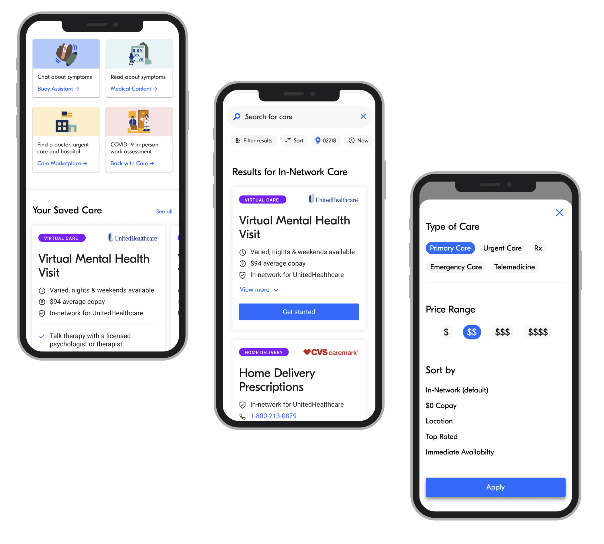
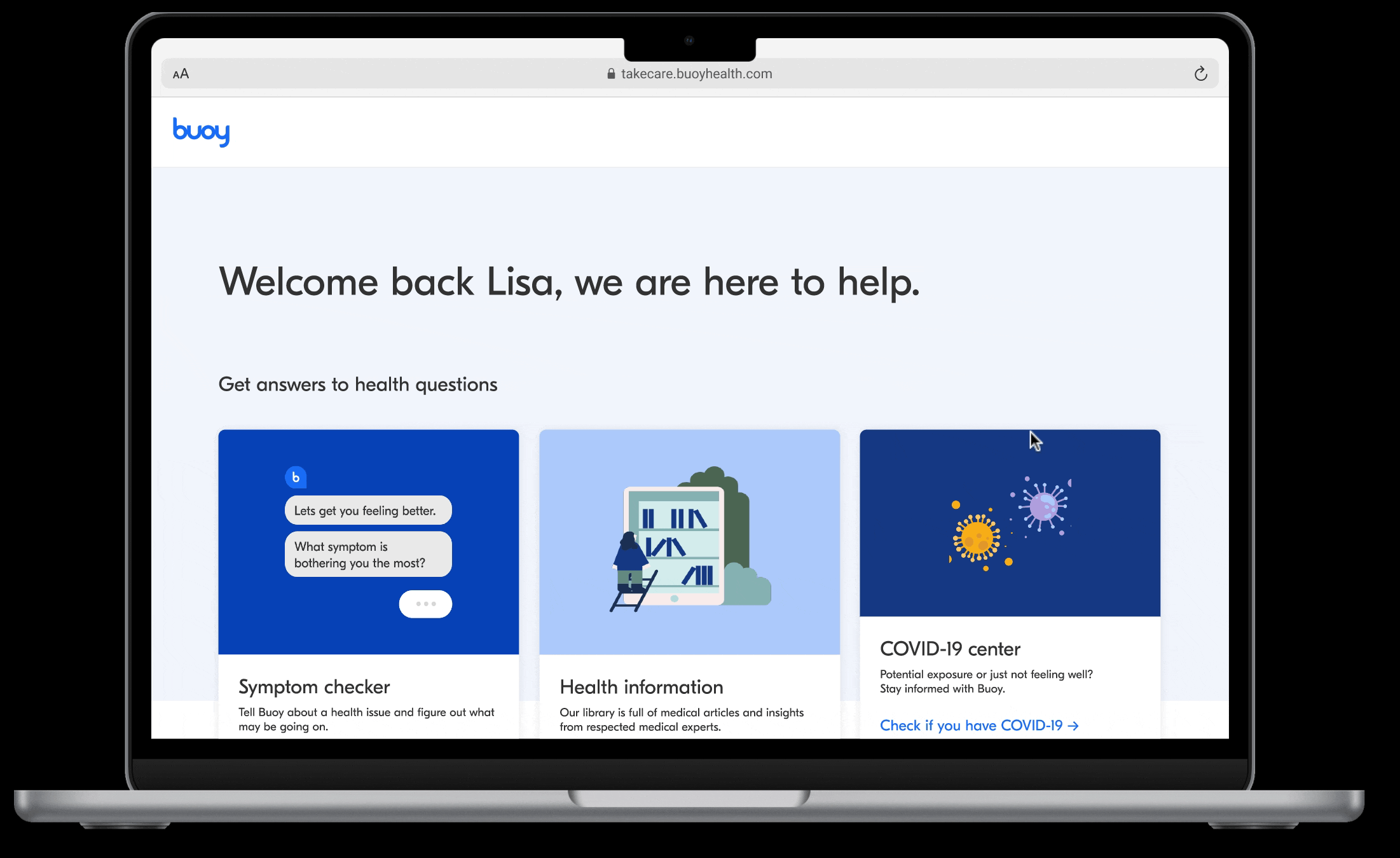
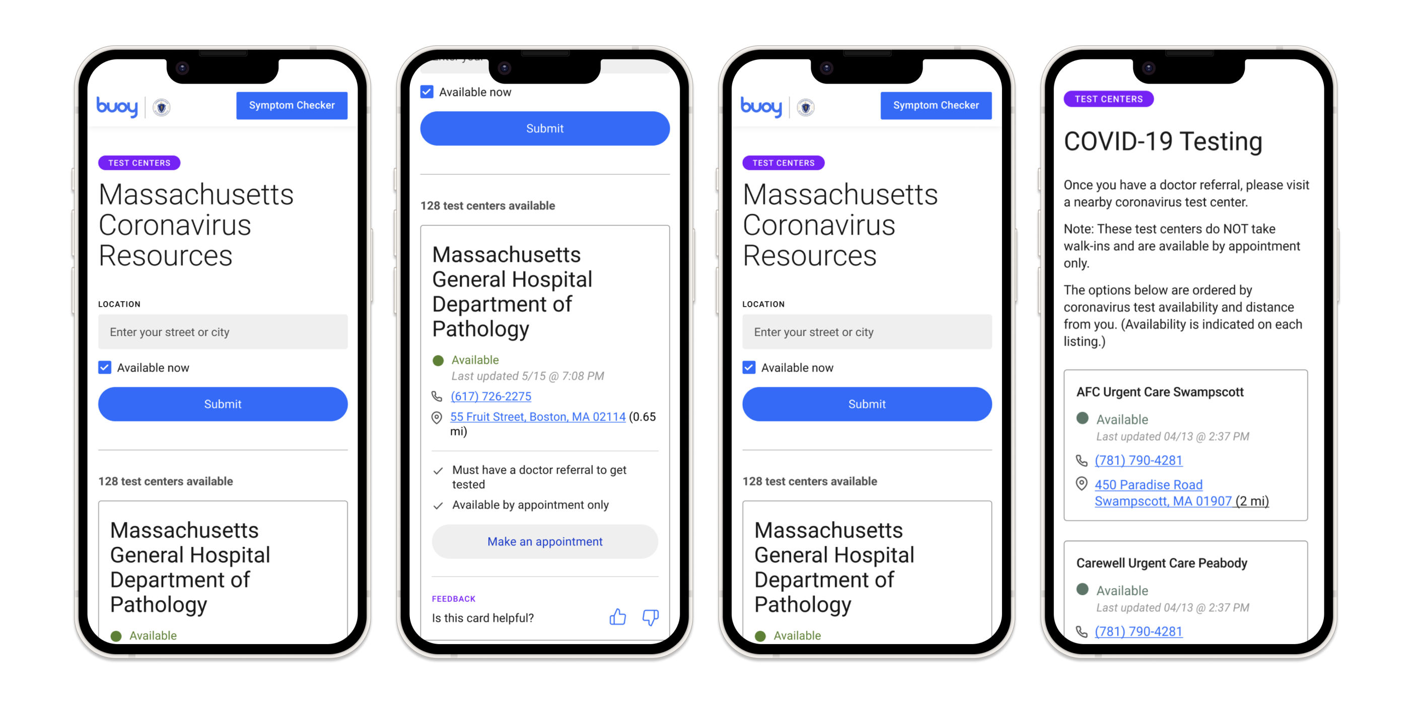
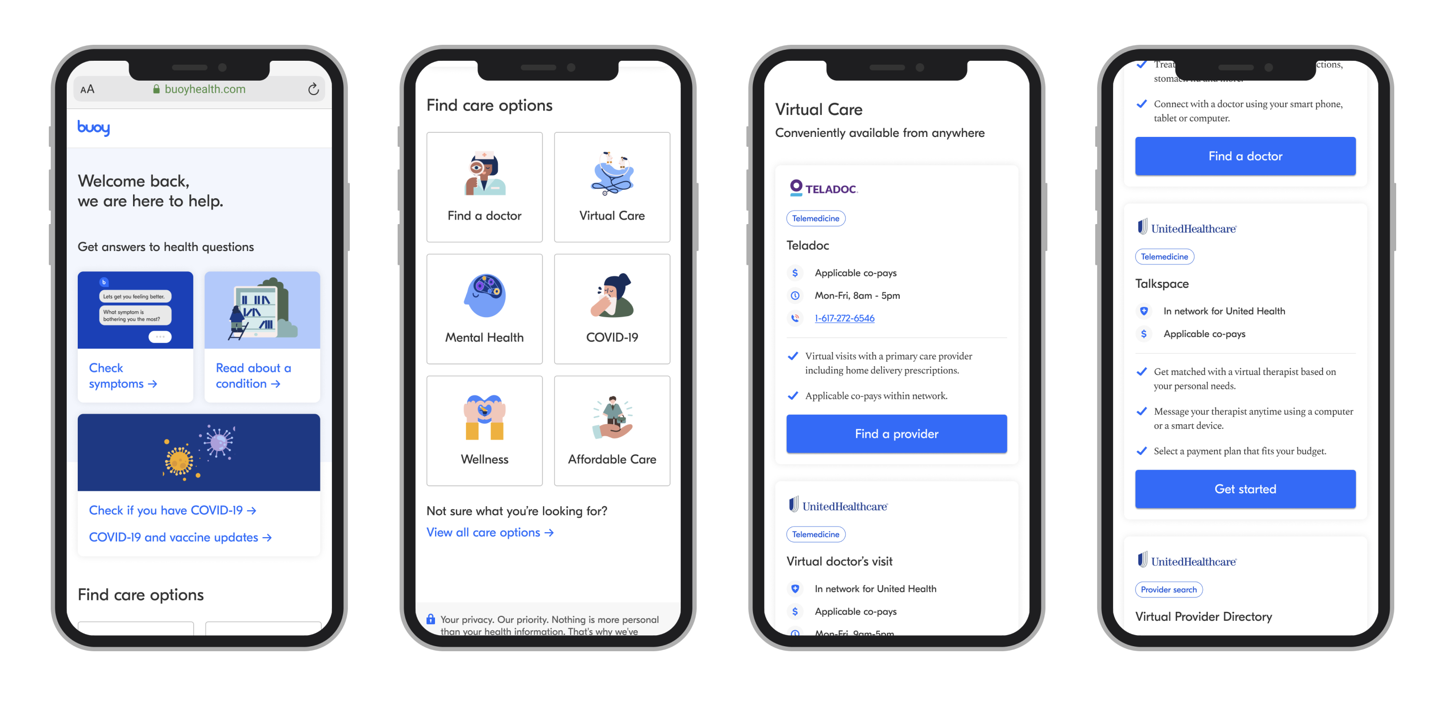
I drafted out a user journey map as a first step in the product ideation phase. As a user registers for Buoy through their employer portal, they are directed to Buoy’s homepage — which includes the AI symptom checker, Buoy’s curated medical articles, COVID-19 resource center, and the ability to view care options via targeted categories.
Items that were out of scope: onboarding (sign up and registration), universal search, and employer sponsored content.
Low fidelity wireframes
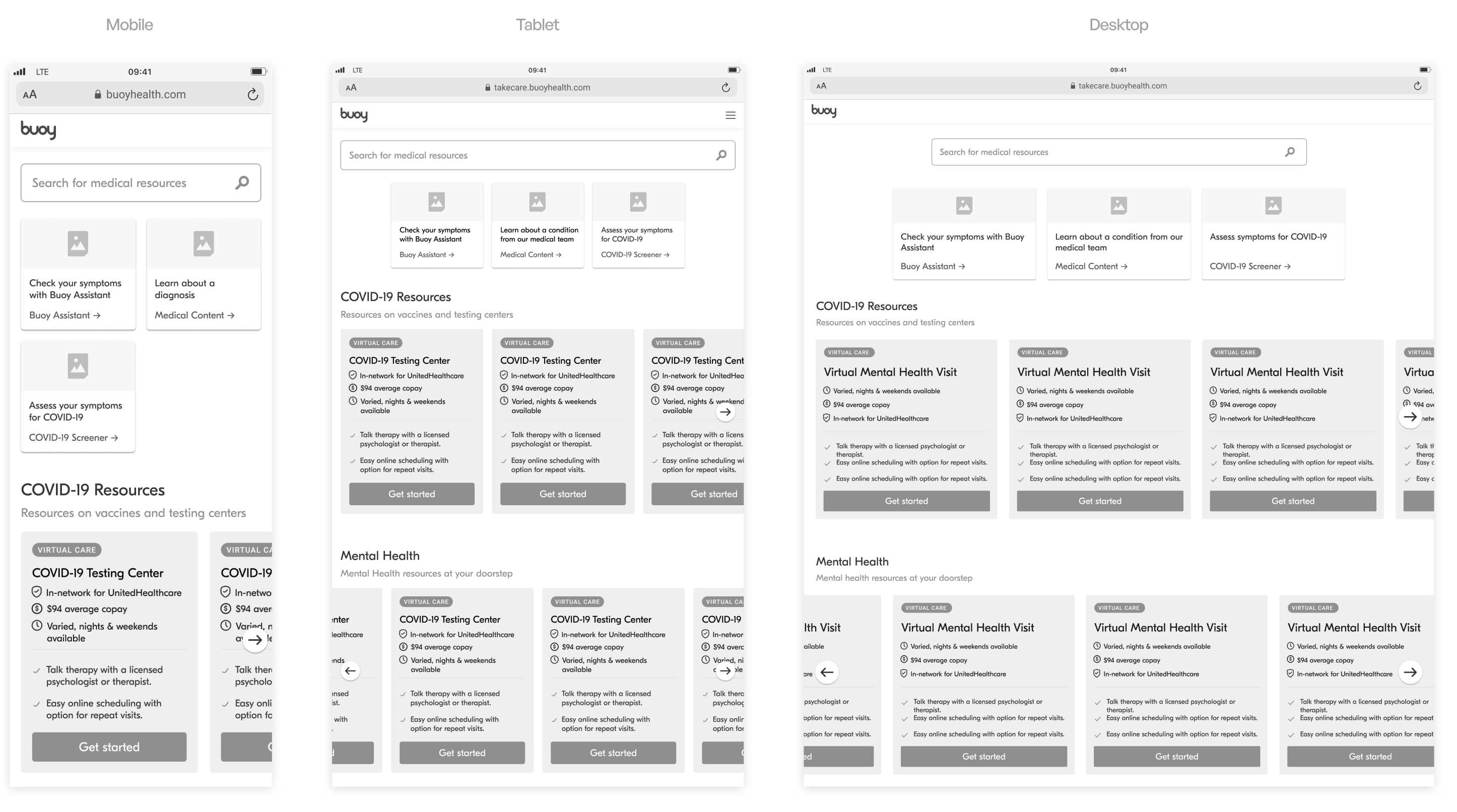
Next, I translated the user journey map into low fidelity wireframes and consulted our stakeholders for feedback. A key aspect was designing for multiple screen sizes as prior Buoy was primarily accessible on mobile.
Establishing Buoy's first accessible design system
Designing a brand new user interface required creating a design system and meeting accessibility standards within the healthcare industry. This allowed us to prevent bottlenecks with engineering, ship products faster in the long-term, and present a product consistent with our brand.
Placing accessibility at the forefront
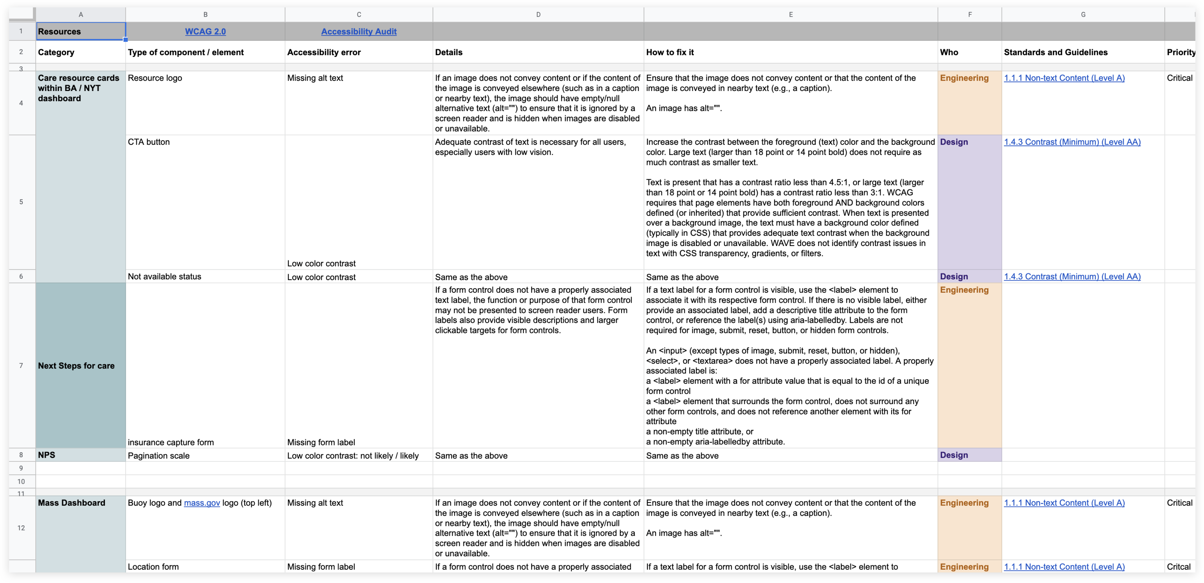
To create an accessible product, my first approach was conducting an accessibility audit of our existing product with the following goals:
- Identify components with accessibility errors
- Write out details of the accessibility error
- How to fix the accessibility error
- Team responsible for amending the error
Building blocks of the design system
Creating a new design system requires establishing a foundation for grids, spacing, typography, and color usage. To guide this approach, I used the Atomic Design Methodology.
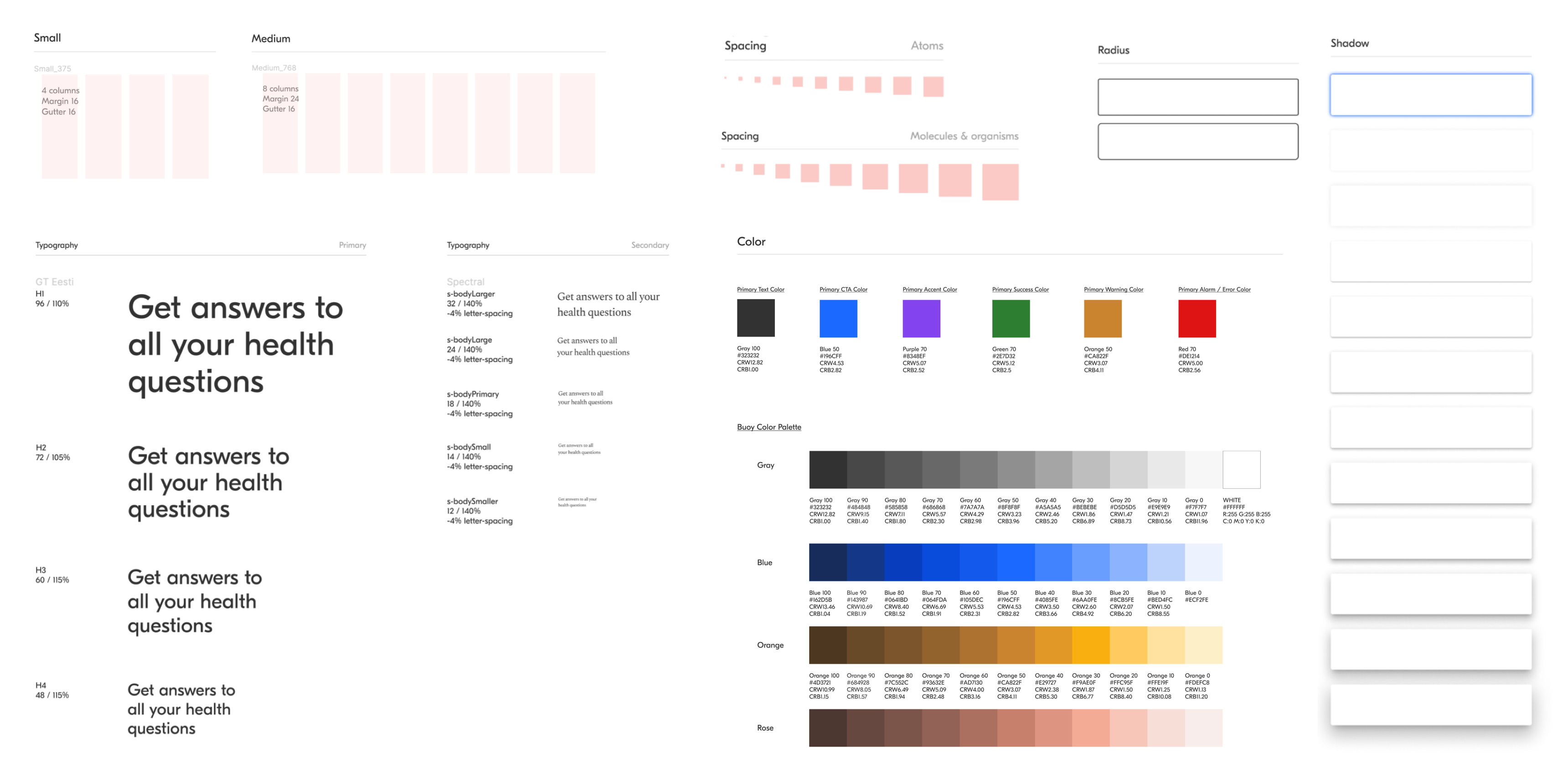
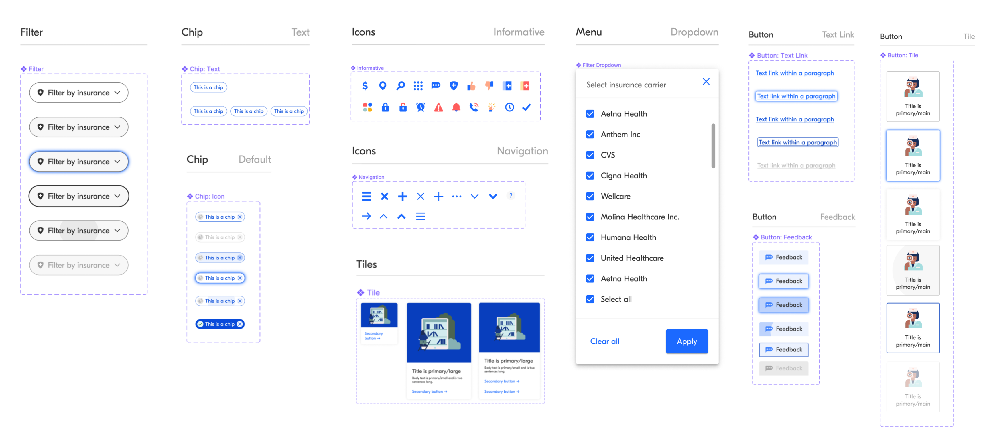
Atomic and molecular components
This gave me the platform to create our essential components such as icons, filters, menus, and buttons. Following the accessibility guidelines, it is essential that each state represents a clear indication. For example; For the hover state, I created a blue shadow outline to give a clear indication of the selection state when using a keyboard.
Hey there, this is the default text for a new paragraph. Feel free to edit this paragraph by clicking on the yellow edit icon. After you are done just click on the yellow checkmark button on the top right. Have Fun!
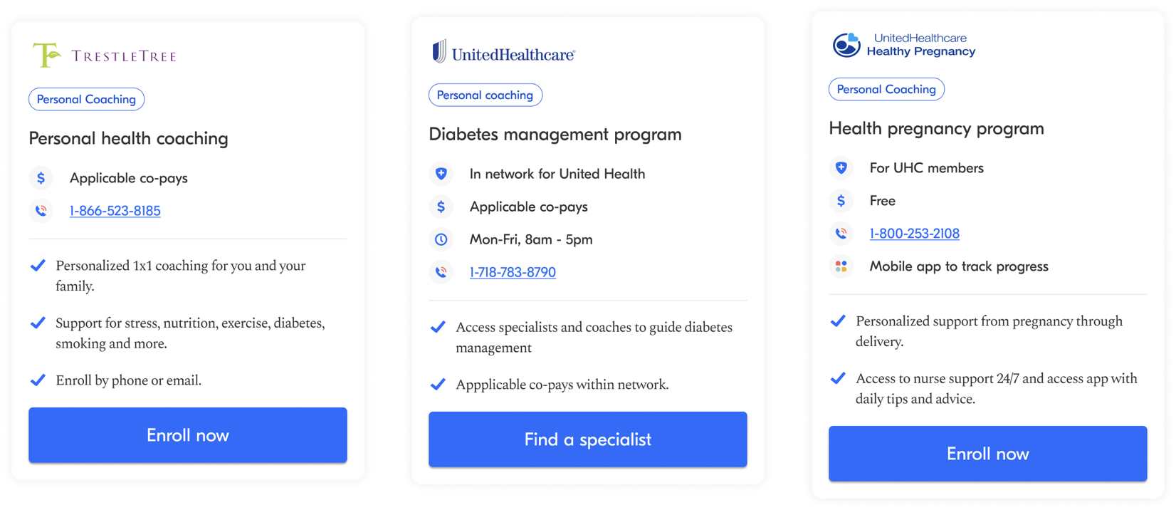
Making our care resources accessible
I re-designed our care resource cards addressing accessibility concerns. I aligned all elements to the left for better readability, used iconography to aid primary information, and ensured the CTA button was AA compliant.
Old design
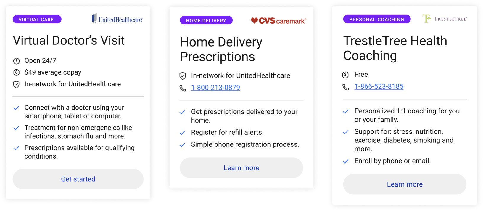
New design
Documenting the design system
In partnership with our front-end engineers, I documented specifications of each component for a seamless hand-off process. I articulated the usage of each component with spacing and padding guidelines, along with the interactions required for each state.
Testing and validation
As we got our design system up and running on storybook. I translated the low fidelity wireframes into a high fidelity prototype and conducted a few rounds of user tests. The goal was to test out the usability of the experience and identify gaps.
I drafted a user research study with 20 participants on web and mobile. A key challenge was asking participants to think of a hypothetical health scenario which meant I had to be mindful of any biases involved in our findings.
Turning point for design
We received constructive feedback and the prototype failed. It was a mistake on my part not advocating to test the wireframes early on in the ideation phase.
Rapid fire design sprint
Because of our tight timeline, I took in this feedback and rapid-fired a design sprint in 24 hours by creating multiple approaches with varying information architecture and interactions.
The MVP
Through multiple rounds of cross ABC testing, we found that users wanted a very simple and easy to navigate experience. The information architecture consisted of two offerings:
The primary offering
A landing page that showcases Buoy’s health tools. I partnered with our content team to ensure our product presents an inviting and comforting tone that is consistent with our brand.
The secondary offering
A curated list of health resources available within categories. I partnered with our brand team to integrate our playful illustrations to represent healthcare categories.
Before → After
Drag arrows to view before and after
The hand off process
I conducted a final round of user tests to validate the design solution and hosted a company wide readout. As we got pushback from the C-suite and stakeholders, I advocated for our design decisions through user feedback and data.
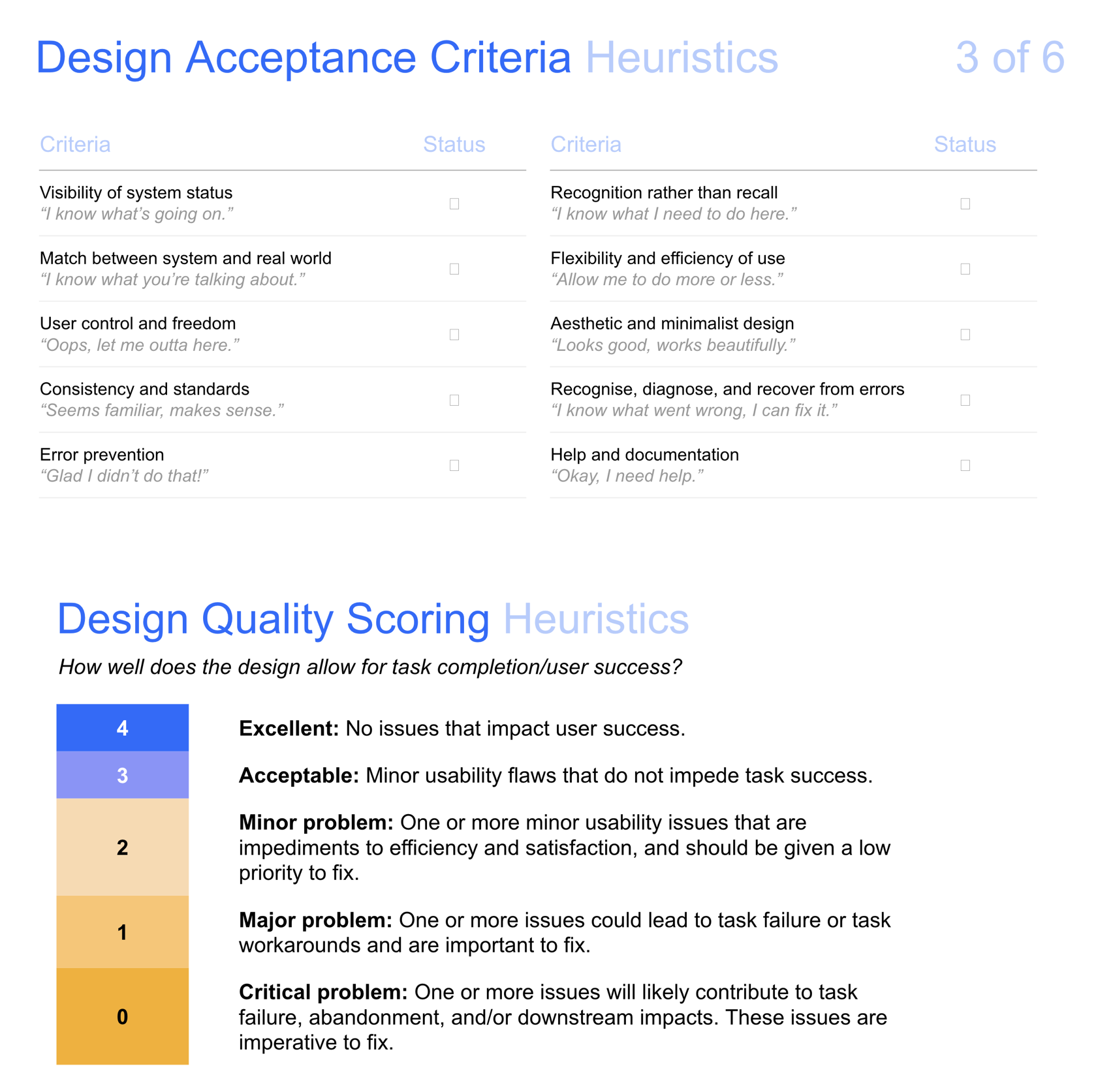
Design quality score audit
As a final step, I conducted a quality score audit to ensure that we are meeting our accessibility, usability, and heuristic standards. I compiled all components, specifications, and designs for engineering hand-off.
METRICS OF SUCCESS
3 major customers
In 90 days, we designed, built, and launched an MVP for our new product offering. Buoy acquired three major customers: The New York Times, Humana, and Houston Methodist.
$6.3M in annual revenue
The MVP forecasted to bring in $6.3M in annual revenue.
Foundation for broader solution
The MVP was the first step in addressing the unmet market need for healthcare navigation. It helped us lay the foundation for end-user feedback and analytics to maximize on value.
Challenges
Broad problem statement: constantly narrowed focus based on constraints.
Small engineering team: balancing end-user value with feasibility.
No business analytics or metrics: relied on user testing feedback.
Remote work: design process was executed on a 10hr30m time difference, communication was vital for success.
Advocating for design to have a seat at the table.
Diving into the unknown: taught myself how to design for accessibility and build scalable design systems.
Lessons learned
Always be data-centric to maximize value for end-users.
Testing early in the process.
Testing experiences across multiple screen sizes.
Diving deeper into understanding constraints of key stakeholders to connect the dots between business objectives, end-user needs, and product strategy.
Enjoy the process!
 in Sri Lanka